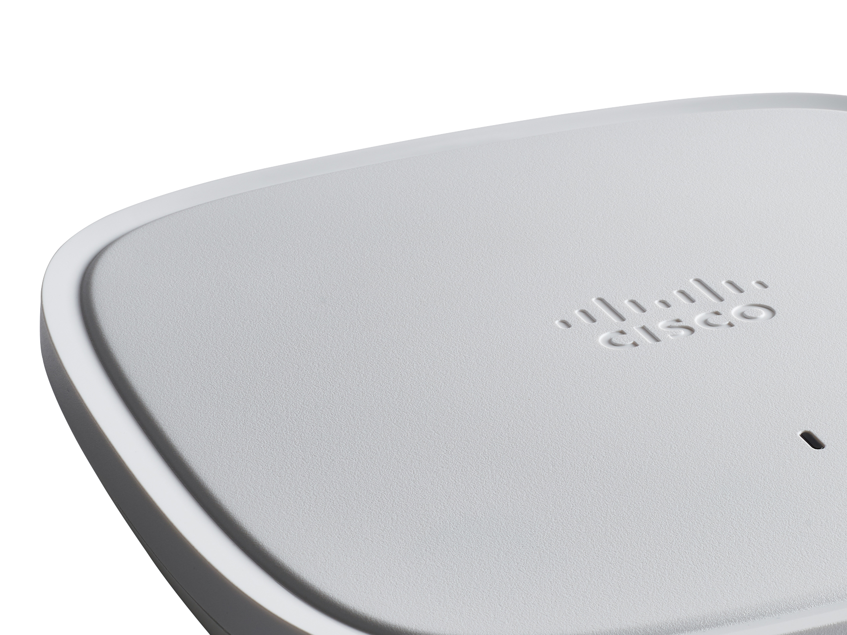
Cisco Catalyst Series.
At Pininfarina, we've supported Cisco's efforts to unify design language throughout their portfolio.
We've helped shape the new generation of Catalyst products.
We've helped shape the new generation of Catalyst products.
A project that not only leveraged the established design language, but also showcased how it can be stretched to address new and exciting solutions that stand out on the market.
By studying manufacturing capabilities, existing and upcoming features, and translating the Cisco Brand voice into physical form, we've empowered and provided the tools to the engineers to make sure that the easiest solutions are the better ones.
As a team with Cisco's designers and engineers, we've helped create products that secure customers' mindshare. Sometimes we've provided just a review, at others we've managed our team of engineering partners to provide final CAD.
The products such as HyperFlex, C9500 and 9600 Series and the 1000Series, are just a few of the ones where we have had a deep and intimate involvement from conceptual phase to first sample review.
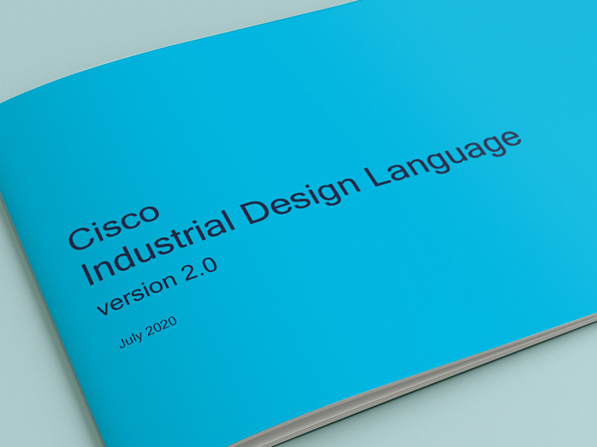
That involvement, in turn, helped us to refine and update the Industrial Design Language.
The products such as HyperFlex, C9500 and 9600 Series and the 1000Series, are just a few of the ones where we have had a deep and intimate involvement from conceptual phase to first sample review.
That involvement, in turn, helped us to refine and update the Industrial Design Language.
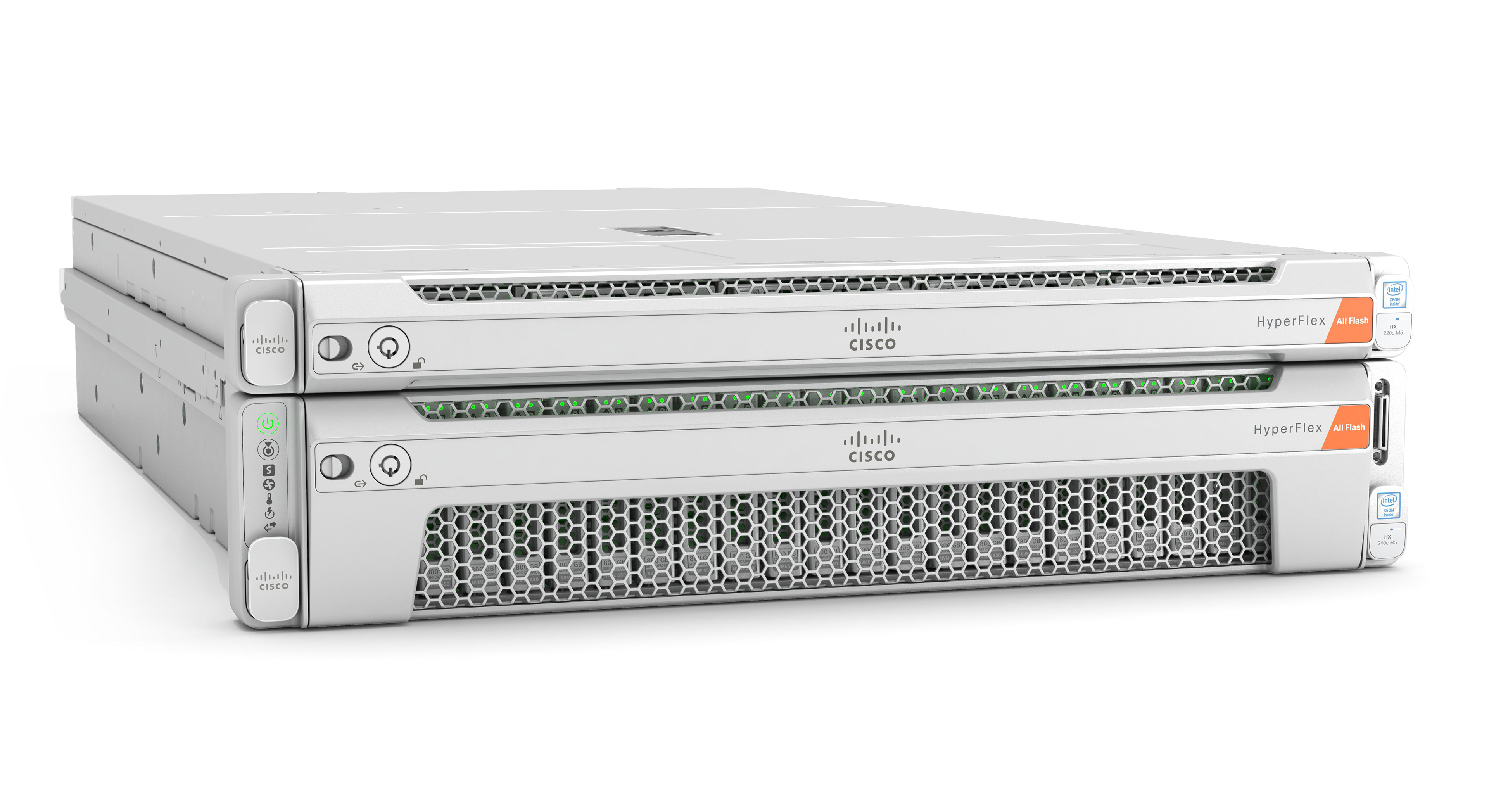
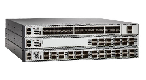
A sort of Atomic design system applied to physical components. Each component is considered in terms of color, form, shape and material. Then it is considered as a part of a modular system, with upcoming and legacy configurations.
Of course, dealing with a huge legacy interoperability, legacy colors and functional constraints ( think airflow, electro-magnetic shielding, etc. ) it was important to evaluate which elements could be applied, which must be retained and how the language can be flexed without breaking.
Of course, dealing with a huge legacy interoperability, legacy colors and functional constraints ( think airflow, electro-magnetic shielding, etc. ) it was important to evaluate which elements could be applied, which must be retained and how the language can be flexed without breaking.
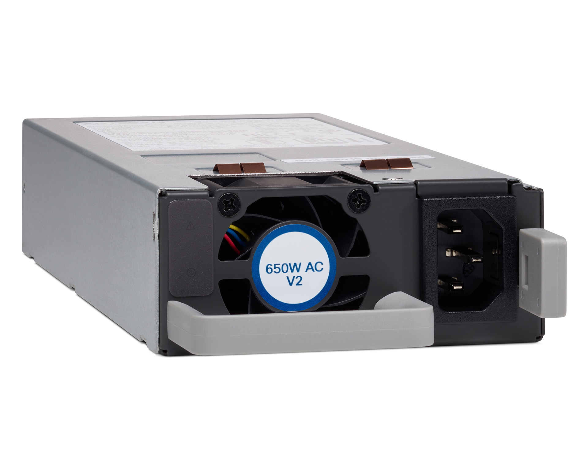
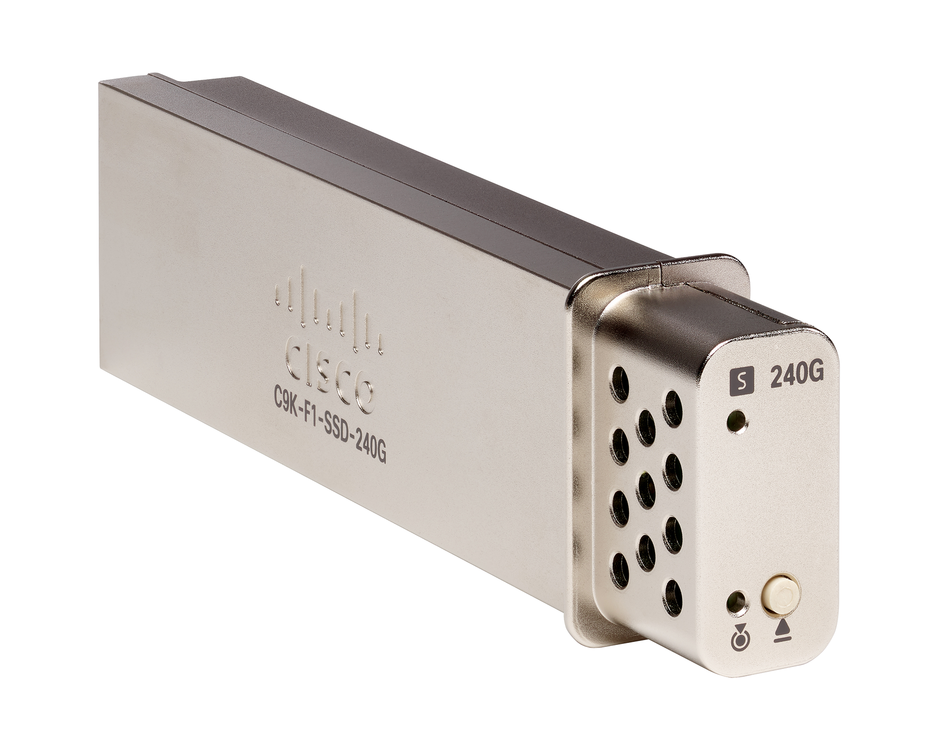
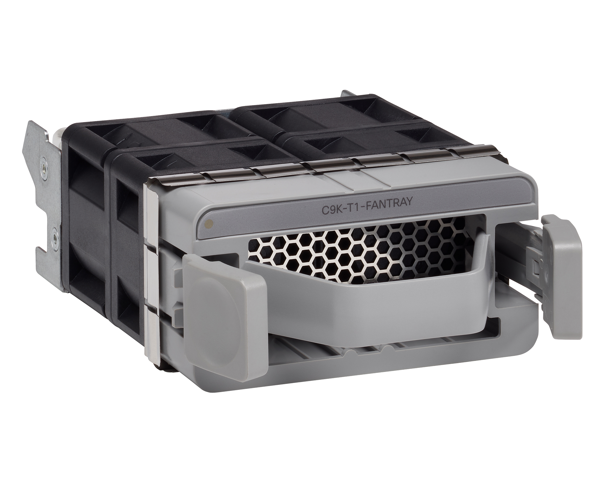

Through our involvement and rigor we were able to onboard the internal Usability testing group to test not only the interpretation of icons and their position, but also the physicality, prehension and tactile feedback of the interaction.
Taking initiative through direct contact with the manufacturing partners we were able to better explain and demonstrate our design suggestions to the engineers. That can only happen in a partnership built on trust.
